

Colors play a big part in any design and even our lifestyle. People often use a specific color because it has a particular meaning. Find out how to use colors in your art and design. You will learn how to choose colors from the color wheel or just pair colors together.
Color Palettes
Using a ready-made color palette is probably the easiest way to add color to any design. I often use color palettes for my illustration projects. Even if you're using an app like Canva, it also has built-in color palettes to help you with your designs.
Websites I like to use for getting free color palettes
These are just a few of the many websites out there to get amazing colors for your designs.
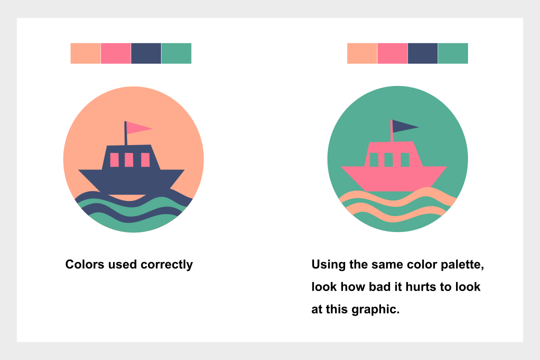
How to use your color palette
Having a color palette is half the battle; however, knowing how to use it is just as important. So we will use a simple technique to see which colors pair best within our color palette. So I created a page with each color from my color palette using squares, and within the squares of each color I have the rest of my color palette, as you will see in the image below. Where I have placed an x, that means those colors don't go well together. In fact, it hurts the eye a bit to look at them. This is why pairing colors is important, even if you're using a color palette.

Use Color theory to create colors
Learning color theory can be very technical for beginners. Even I had a hard time understanding it. So through trial and error, I've learned how colors work. So I will share the easiest way I use colors.
Use Complementary colors
The best and easiest place to start if you're a beginner in color theory is by learning what complimentary colors are. They are colors that are opposite each other on the color wheel. This wheel can be found in almost any design software. Here's an example where I will choose a blue color, and opposite it on the color wheel is yellow.

Once you've chosen your two colors, you want to make one darker and one lighter. This will give you more contrast.
Now let's add two more colors to this palette.

It does matter if it's blue or yellow. Take one color and make it lighter to be like an almost white color, and the other make it almost black. As you will see in the example above,
The end result is a balanced Color Palette. Where no colors are clashing or incompatible. From light to dark, where each color is darker than the next, is probably my secret to making a great color palette.
Conclusion
You will learn how to use a color palette efficiently. Where to get them from. Websites like colordrop io, Coolors Co, and Canva color palette generator. Above all, learn how to pair colors that work and use color theory to create a complimentary color scheme.
0 Comments